Using flourish.studio to Create Data Visualisations
0One of the tools that I suggest to those looking to take their data visualisation to the next level is flourish.studio. Like others in this arena such as datawrapper.de and Tableau it offers a powerful collection of visualisation outputs for your datasets. It offers a particularly, rich set of interactive options for your data visualisation pleasure. These visualisations are useful for your own analytical use and more particularly for presenting your findings to others.
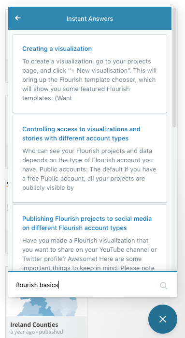
Flourish.studio provides an online and always accessible help system when you are working with your data to help guide you through the process. The large question mark at the bottom right hand side of the page gives you access to a repository of hints tips and

There are also a wide selection of tutorial videos available in YouTube to help you et familiar with the interface and possibilities of flourish.studio. In particular, I would point you towards Alberto Cairo’s intro video series on flourish.studio to get started.
Flourish.studio requires creating an account and this gives you substantial access to create and store your visualisations.
Once you login to Flourish.studio you will have a small menu giving you options:

From this menu you can choose to create either a visualisation (there’s a vast number of types) as well as a collection of visualisations you create, drawn together to tell a data-driven narrative. If you have previously authored visualisations, they will also appear here – this is your dashboard.
When you choose to create a new visualisation, flourish.studio will present you with a very extensive visual gallery of the visualisation templates that it has available. This can be either daunting or dangerous. It does require that you have some sense of what sort of way in which you would like to visualise your dataset. Flourish.studio’s creators have chosen an example driven means of instruction and when you choose a visualisation it will immediately be populated with demonstration data to show you how data should be formatted and as well as show you what the resultant vis will look like.
From this screen you can adjust a wide variety (really wide – and vary according to the type of visualisation you have chosen) of parameters involved in how the visualisation is constructed. Making changes to the parameters is immediately reflected in the visualisation to the left.
To upload your own data, you select the data tab at the top and move away from the visualisation tab.

On the data screen you can modify data manually or choose to upload your data in a variety of formats. Note that this can either replace the data already in the online file or it can augment the data already there. The format of the data you upload will be particular to the type of visualisation you are creating. For example, flourish.studio will accept a geoJSON file which would be particular;ar to creating cartographic primitives to be visualised.
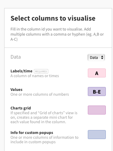
When you have data present in the data table, flourish.studio allows you to choose which columns are to be visualised on the screen to the right. Any changes you make to this are shown in the min0-preview below your choices.

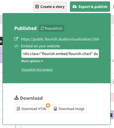
The final step in the process is sharing the visualisation once you have achieved the look that you want. You share your creation via the Export & publish button.

Flourish.studio gives you the ability to save the visualisation as a static image file that you can use onscreen or in print or to embed the visualisation with interactive components on your blog or other online source. Flourish.studio constructs embedded code for inserting into your HTML source as well as a unique URL that you can also use to share your constructed visualisation with others.

Flourish.studio is an excellent tool for working with your data in an experimental fashion and creating compelling interactive visualisations to enhance your data-driven narratives. It offers a wide range of types of visualations and ways in which to customise the appearance and functionality of your creations.
Try it and see what you can produce using the data that they provide to experiment with (or your own), take a look at the YouTube videos referenced above or the variety of others out there and learn by doing.
Most importantly, think about how the pictures that you create from your data help others to understand what you have identified and see in the data you are working with.