Using Onodo to Learn Network Analysis and Visualisation
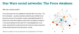
0During our seminar on Network Analysis and Visualisation in DH6010/6019 this past semester as a group we enjoyed a case study involving network analysis of the Star Wars characters presented by Evelina Gabasova (http://evelinag.com/blog/2016/01-25-social-network-force-awakens/index.html#.V7Mn5WXi-f4). She does a superb job of combining analysis, explaining her methodology, deriving some fascinating deductions – all with a fun cinematically familiar network. The familiarity combined with Gabasova’s well crafted blog posts really helped everyone grasp the basic precepts of graph theory and set up hands-on network visualisation instruction using Gephi.
One of the challenges in approaching and using Gephi (http://gephi.org) is that it has so much flexibility, power and such powerful capabilities that is can be off-putting for new users. The interface is not immediately intuitive and even with many of its panels minimised it tends to scare people off. It takes time and a deeper understanding of graph theory to appreciate its benefits and to be able to use it effectively – especially for analysis.
Recently I have been turned on to Onodo (https://onodo.org) to quickly create useful network visualisations and carry our rapid analysis. Onodo is a user friendly tool for doing basic visualisation and analysis within a browser making it cross-platform right out of the box. Data can be entered via their intuitive, in-browser node and edge creation tables or imported from a file. As data is added it is instantly previewed and displayed. The visual appearance can be tweaked on the fly and customised in a variety of ways (including applying a unique image or URL to each node). Once created, visualisations can be embedded and shared outside of the Onodo browser environment. Moreover, with a click of a button, Onodo calculates standard network parameters such as betweenness, closeness and displays these values within the table. It calculates and demonstrates basic network parameters and measures quickly and allows for the creation of chapters that cement using the visualisation as a data-driven narrative device.
Onodo lacks the vast flexibility and API of Gephi, but I can immediately see how I will be using it in the future to introduce users to network analysis and visualisation. It’s fast, intuitive, flexible and immediately accessible. It runs within a browser and so requires no custom workspace configuration. It provides a basis to expand understanding and to support interrogation of networks as familiarity grows and it provides a powerful platform to create the building blocks to drive a powerful data-driven narrative.
If you haven’t checked out Onodo yet, do! There’s a guided demo (https://onodo.org/demo) available. Additionally (and far more fun) there is a gallery (https://onodo.org/gallery) of sample network visualisations and to really make playing and experimenting fun you can duplicate any visualisation you find (you can make your own public as well) and this gives you a great dataset to work with right out of the blocks.
No excuses! Go forth and discover the potential benefits of network visualisation and analysis for your own data.
Share


